Chapter 8 ~ The State of Computing
⬆ Shiftrefresh Shift-Refresh this page to see the most up-to-date instructions.
In the previous chapters, you learned about how computer technology works and some of the positive and negative consequences of that technology. And if you're looking at your news feed on a regular basis, you'll notice even bigger problems which governments are trying to resolve (or perpetuate). In this chapter, you'll research and write about four major issues that countries around the world are struggling with. Should we allow the censoring of some content? Should we use technology to enact justice? Should everyone have the right to free high-speed internet access, or should some people pay more for higher speeds and better service at the expense of others less fortunate?
Most of the students in this course are American citizens and as citizens, you are obligated to tell your government representatives what you think is the right course of action. One way to do that is to write or call your representative. To encourage you to do that, we'll learn to manipulate a set of data which is freely accessible through the USA and State of Oregon. We'll learn more about the political makeup of Oregonians in the process.
This chapter's skills and discussion will take between 4 and 12 hours to complete.
8.1 What are spreadsheets versus databases?

In the last chapter, we learned to input data into a spreadsheet table so we could contribute to a larger set of meaningful data. The sets of data were consistent — each entry (or row) had a title, a date, a picture, a URL, etc. — and all the data was visible on a single table. The simple rows and columns of a single table of data is referred to as flat-file database. Sets of flat data are typically manipulated in a spreadsheet file due to its simplicity. In this chapter, we'll manipulate another set of flat data from a single table using Pivot tables. We'll also visualize (or chart) that data so it is easy to understand at a glance.
Another kind of data manipulation involves the lookup function where one row or column looks for data in one sheet and adds it to another sheet, thereby interacting dynamically to eliminate redundancy of data entry. Related columns or rows in a data sheet use keys (also referred to as indexes) to correlate the shared data. Complex sets of data with keys and relationships are typically referred to as relational databases. We'll experiment with that too, using a vertical lookup function.
8.1.1 Write in a Spreadsheet file.
Write and format what you learned about spreadsheets and databases.
- Launch a spreadsheet application:
- Google Sheets
- Microsoft Excel
- Open a Blank worksheet file (you might already have one open).
- Name the file Oregon-Counties-Parties-Reps-Senators-first-lastname (use your own name) and move it to your CS 101 folder.
- Rename the existing sheet as Cover.

- Stretch the A1 cell's boundaries so it is roughly 3 inches wide and 2 inches tall by
dragging the bar between row 1 and 2 as well as between column A and B.

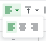
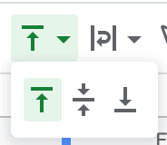
- Apply the text wrap and align left as well as vertical align top settings.
- Google Sheets

- Microsoft Excel
- Google Sheets
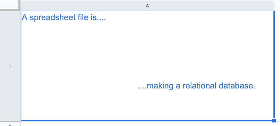
- In the large cell, describe how spreadsheets become relational databases.
Include in your description, all of the concepts learned from the paragraphs and diagram in step 8.1, above.
After you complete the remaining steps of the assignment,
revise the paragraph to include more detail relevant to how you created one (but write in the third-person style).
- Change the font size to 14pt and the color to a bright blue.
8.2 Make a Pivot table of political parties.
Government-funded data collection is often freely available to citizens as part of the USA Freedom of Information Act. The State of Oregon posts much of their data on the OpenData website. For the following lessons, we'll use the current data from these sources:
- Oregon Voter Registration (.csv download, import)
- House of Representatives (.csv download, import)
- Senate (.csv download, import)
- State Senators by District (Blue Book select, copy/paste)
8.2.1 Import the data.
- From the Oregon OpenData website,
navigate to the
Voter Registration by County page for 2024.
Export the Filtered .CSV file to your local hard drive. Do not click the CSV for Excel button.
- In the Oregon-Counties-Parties-Representatives-Senators file, add a new sheet +
and name it Voter_Registration_Data.
The underscores are absolutely required for Excel users (hyphens won't work).

- Import the .CSV file:
- Google Sheets
> the Voter_Registration_Data.csv file so that it Replaces current sheet in the blank file.
- Microsoft Excel
Many versions exist and no two are alike when it comes to importing a .CSV file. Try ONE of these methods:- From the Data tab, choose Get Data > From File > From Text/CSV > Load to... > Existing Worksheet or New Worksheet.
- From the Data tab, choose
Get Data (Power Query)
> Text/CSV
> Next
> Connection Settings Browse and pick the correct .CSV file.
> Preview > Load.
This version will automatically add the data to a new sheet.
- Google Sheets
- Save the file to your CS 101 folder for easy access.
8.2.2 Freeze the column headings.
- Select the first row using the row selector. While the row is highlighted,
- Google Sheets
> > 1 row to create a header for the data.
- Microsoft Excel
> > Freeze Top Row to create a header for the data.
- Google Sheets
8.2.3 Create the Pivot Table.
- Select all of the columns by clicking the Column/Row selector in the top left corner of the worksheet.

- While the three or more columns are selected:
- Google Sheets
From the menu choose . It will open on a new sheet.
- Microsoft Excel
From the menu choose .
If you get an error, then go back and select all the columns.
- Google Sheets
- Rename the new Pivot sheet to Major Parties Pivot.

- On the Pivot table's right pane, select and add the county, party, and count fields to the rows and columns:
- Google Sheets
Add County to the Row option and choose by and Show totals.
Add Party to the Column option and choose by and Show totals.
Add Count(V.ID) to the Value option and choose by .
- Microsoft Excel
- Using the field checkboxes, choose County, Party, and Count(V.ID).
- Drag the Party menu from the box into the box.
- Drag the Count(V.ID) menu from the box into the box.

- From the menu, choose . You may have to click on the table to get it to activate the Pivot table sub-tabs/menus, which includes the tab. (If you accidentally hid the Field List pane, then right-click on the table heading and choose Show Field List.) Click and drag to select the data in these columns: C (Democrat), D (Independent), G (Nonaffiliated), J (Republican), Selecting the entire column will not work; select just the data in those columns..
- Click on the Values >
to activate the screen.


Or click the > menu.
In the tab, choose Sum. Then, click the the tab of that same screen to choose % of Grand Total. Click OK.
- Additional help: You can also use the search field to find field settings. If that doesn't work, then Load the Analysis Toolpack.
- Google Sheets
- To improve the overall impression of the data, we'll eliminate parties with very few members to focus on major players.
- Google Sheets
Shift-click on the blank column letter for the Constitution party column to select it. Right-click to Hide Column. Do the same for Libertarian, Other, Pacific Green, Progressive, and Working Families columns, leaving only the major parties active: Democrats, Independents, Non-affiliated, and Republicans.
Also, hide row 3 if it is blank. - Microsoft Excel
Click on the filter icon in Column B. De-select all the column labels, then select only the major parties: Democrats, Independents, Non-affiliated, and Republicans.
Also, hide row 3 and/or column B if they are blank.
- Google Sheets
- Notice the data is sorted by county and the grand total tells us
there are more registered Democrats and non-affiliated people than registered Republicans.
If you got some other result, revise the Pivot Table's Row, Column, and Value options.
If you have blank rows or columns, right-click on each and choose Hide Column or Hide Row to remove them.

- To prepare for the next steps, click and drag from the top left cell to the bottom right cell of the Pivot table data.
but do not include the grand total row or column:

- Save the file with Ctrls or ⌘s.
8.3 Visualize the data in a Pivot chart.
To better visualize the percentages of people registered in each party, we'll design a chart. Charts can remove the tediousness of comparing and evaluating each complex value 00.00% with another.
8.3.1 Draft the chart.
- With the Major Parties Pivot Pivot worksheet active,
- Google Sheets
From the menu choose . From the Panel's menu choose Stacked Bar Chart. Then, from the menu choose Standard. Or, from the menu choose Stacked Bar Chart.
- Microsoft Excel
From the menu, choose Pivot Chart. Or, from the tab > or tab choose .
Choose the Bar and Stacking Bar style.
New versions of Excel have newer menus. Locate the Change Chart Type menu's Columns section, then choose the 2D Stacked Bar type.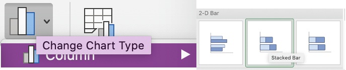
You may need to stretch the chart using the corner handles in order to see all of the rows and columns.
- Google Sheets
- Move the chart to a new worksheet:
- Google Sheets
Click the tiny 3-dot vertical menu at the top right corner of the new chart: Choose Move to own sheet.
- Microsoft Excel
From the and menu choose > New sheet.
- Google Sheets
8.3.2 Redesign the chart.
- Double-click the worksheet name and change it to Major Parties Chart.
- If the chart does not have a title, or vertical and horizontal axis,
add them by using the Add Chart Element menu on the top left,
or by using the + element.
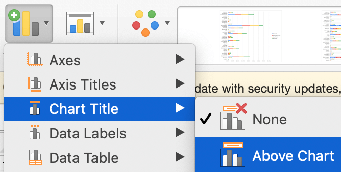
- Change the chart's title text to Major Party Affiliations in Oregon 2024
and change it and the axis color to bright Blue (the brightest option) and
font to Tahoma (it may be inherited from the chart style).
- Google Sheets
Edit Chart and from the Panel's menu choose Tahoma font and check the Compare Mode box. Then,- From the menu update the color to bright Blue and font-weight to bold. The Tahoma font should get inherited from the Chart Style.
- From the menu check the Total data labels box.
- From the and menus, change the text color to bright Blue.

- Microsoft Excel
From the > tab choose > menu, choose Above Chart. Update the name of the chart.
Update the vertical Axis to say County and change its color to bright Blue (if allowed).
Select the vertical labels and change their colors to bright Blue using the pane > > . Do the same for the horizontal labels and the title.
- Google Sheets
- Change the chart's Legend orientation to vertical, on the right, and to Blue:
- Google Sheets
Click on the Legend. From the Panel's menu for Legend, choose Right from the menu and update the text color to bright Blue. If the text labels were not provided next to the colored boxes, double-click on them to type the correct names.
- Microsoft Excel
If the Legend shows too many parties, use its down-arrow ↓ to deselect all but Democrat, Independent, Nonaffiliated, and Republican parties.
Right-click on the Legend and choose . From the tab, choose Right from the menu. From the tab, choose bright Blue from the text color picker.

- Google Sheets
- Save the file with Ctrls or ⌘s.
8.3.3 Doesn't your chart look great!

The results of your chart design should look something like this.
Notice that the title and labels are bright blue, the chart bars are horizontally stacked, and the legend is in the top right corner (or to the right middle edge).
If you used the Google Sheets application, then you can also display the values at the end of each bar. Excel does not allow this, so it is optional.
From some versions of Excel, the chart will result in different colors, spacing, and sorting:

8.4 Merge data with vLookup to create a database.
Merging one set of data with another can help pinpoint specific related items. In this lesson, we'll import data of the Representatives for the House branch of the Oregon Legislative government then modify the house district number so it becomes the 'key' between it and the Voter_Registration_Data. The key will allow us to merge County data with the Representatives data, creating a relational database. Then, you'll do the same for the Oregon Senator data.
8.4.1 Import, merge, and improve Representatives Data.
- From the Oregon government website, navigate to the
Oregon House of Representatives website
and download CSV Contact Data to your drive's CS 101 folder. The resulting file will be called house.csv.

- Import the .CSV file:
- Google Sheets
From your existing oregon-county-parties-representatives spreadsheet file, > the house.csv file. Choose Insert new sheet for the destination. Ninami Holman demonstrates how to import the house.csv file into Google Sheets. (2019)
Captioned.
Ninami Holman demonstrates how to import the house.csv file into Google Sheets. (2019)
Captioned.
- Microsoft Excel
From your existing oregon-county-parties-representatives spreadsheet file, click the + Add worksheet icon to add a new worksheet.
Choose ONE of these import methods:- From the Data tab, choose Get Data > From File > From Text/CSV and pick the correct .CSV file. > Load to... > Existing Worksheet or New Worksheet.
- From the Data tab, choose
Get Data (Power Query)
> Text/CSV
> Next
> Connection Settings Browse and pick the correct .CSV file.
> Preview > Load.
This version will automatically add the data to a new sheet.
- Google Sheets
- Double-click the name of the new worksheet and name it Representatives.

- Save the file with Ctrls or ⌘s.
8.4.2 Make keys/indexes.
To make the key for each sheet, modify the House District columns in both sheets:
- Look at the Voter_Registration_Data worksheet.
- Google Sheets
Click/hold and move the HD_NAME column left to position A in the table.
- Microsoft Excel
There are two ways to move a column:- Select the HD_NAME column, then cut Commandx and then right-click on the A column to choose Insert Cut Cells.
- Or, select the HD_NAME column, then apply the Shift key while pressing down on the column header.
The 4-pointed cursor should appear, which means you can move it to the left.

- Google Sheets
- So that we can more easily match one set of data with another, we'll remove text that might get in the way.
We'll change a string of text and number to just a number.
- Google Sheets
> . In the Find field, type house district. In the Replace field, type a single space. Click Replace All.
Click Done. - Microsoft Excel
Ctrlf > . In the Find field, type house district. In the Replace field, type a single space. Click Replace All.
- Google Sheets
8.4.3 Move a column and freeze column headings.
- Look at the Representatives worksheet.
Move the District Number column to the A position to make it the key,
so it will match up with the other sheet's key.
- Google Sheets
Click/hold and move the District Number column left to position A in the table.
- Microsoft Excel
Click/hold and move the District Number column left to position A in the table.
OR, cut Commandx and select the District Number column then right-click on the A column to choose Insert Cut Cells.
- Google Sheets
- Click row 1 to select it then freeze it to make column headers.
- Google Sheets
> > 1 row to create a header for the data.
- Microsoft Excel
> > Freeze Top Row to create a header for the data.
- Google Sheets
- Right-click on Column A to choose Sort A-Z, so that the District Number column is arranged 1 to 60.
8.4.4 Add the vLookup function.
- Click into the cell at column H row 1 and type County.

- Now, we'll perform a VLOOKUP function to merge the County data from the Voter_Registration_Data worksheet into the
new column County column of the Representatives sheet.
Click into the cell at column H row 2.
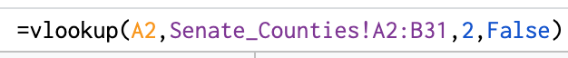
Type an = sign and the function VLOOKUP.
Provide 4 parameters to give the function enough information to calculate.

- A2 is the column and row that will provide the matching key with the Voter worksheet.
- Voter_Registration_Data!A2:B1291 is the range of data to lookup from cell A2 through cell B1291 of the Voter worksheet.
- If the Voter_Registration_Data worksheet name uses only lower case letters, or has a different name, then replace that worksheet name in the function with the exact spelling of your worksheet name. You might need to revise the worksheet name or the formula range name. They must match.
- Or, you can click into the formula, then into the worksheet and select those 1291 rows of data in the two columns.
- Or copy this sheet name and range: Voter_Registration_Data!A2:B1291.
- 2 is the column of data from the Voter worksheet that we'll merge into the Representatives worksheet.
- FALSE is the default for exact matches.

- If you scorted the list by District Number in a previous step, then District 1 should be Curry in the Representatives worksheet.
8.4.5 Duplicate the formula.
- To use the same formula for all remaining Representatives,
Select the cellH2 on the Representatives worksheet.
Drag the bottom right handle straight down to row 61.

And like magic, the rest of the rows take on the VLOOKUP formula and fill in the correlating counties!
8.4.6 Improve readability.
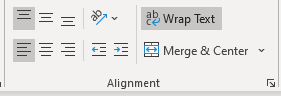
- To improve the readability of this worksheet, wrap and resize all of the columns to display all their data rather than cut it off.
Select all of the columns and rows by clicking the Column/Row selector in the top left corner of the worksheet.
-
- Google Sheets
Click the > > Wrap or use the toolbar's icon to wrap text inside of each cell rather than hide it on the right.
- Microsoft Excel
Click the > > Wrap or use the toolbar's icon to wrap text inside of each cell rather than hide it on the right.
You might also have to click > > Autofit Row Height.
- Google Sheets
- Drag the bars between each column to the left and right to expand and contract them, so that
the District Number or HD Number is as skinny as possible,
the Name columns are as skinny as possible,
the Email address is visible on one line,
the Capitol Address is on two lines, and
the Web Addresss is on two lines.
The goal is to allow the unique information be be easily read at a glance, like this:

- Save the file with Ctrls or ⌘s.
8.4.7 Paste, merge, and improve Senate data.
To practice those complicated vLookup steps again, you'll paste in the Blue Book's Senate contact data and merge it with the imported Senate list, creating another relationship between two sheets.
- Click/drag to select and copy the data from
Blue Book's State Senators by District list.
- Add a new sheet in the same spreadsheet file and title it Senate_Counties. Spelling is critical. Ensure the sheet name does not have spaces.
- Place your cursor in cell A2 and paste the copied data.
- If your pasted data did not include column headings, then, in Row 1, add headings to each column: District, Counties, Contact, Occupation, Years, and Born.
- District will be the Key column (A).
- Freeze the top row.
- Move the Counties column to position B.
- From the Oregon government website, navigate to the
Senate website and download CSV Contact Data to your drive's CS 101 folder.
The resulting file will be called senate.csv.
- Use the same data import process from step Step 8.4.1.2 (or use your memory) to add the Senate data to a new sheet.
- Name the sheet Senators.
- Freeze the top row.
- Move the District Number column to position A (to create a Key).
- Add a header Counties to H1.
- In cell H2, add a vLookup formula that does the following:
- Uses the A2 cell as the Key between it and the Senate_Counties sheet.
- References the Senate_Counties sheet from cell A2 through B31 (or B120 if there are subrows in that sheet).
- Copies the County data from B2, which is in the second position/column (2) of that sheet.
- Sets the exact matches option to False.
If the data pasted into the Senate_Counties sheet has subrows, then use B120.
- To use the same formula for all remaining Senators, select the cell H2 and drag the bottom right handle straight down to row 31 or 120. Excel may do this for you automatically. Google Sheets may provide an option to do this for you.
The finished sheet should look like this:

Revisit the Cover sheet's paragraph about how databases are created. Add more detail based on your recent experiences manipulating sheets to make a database (but write in the third-person style and check grammar and spelling).
8.4.8 Extra Credit Options.
Complete one or both of these extra credit options:
- Manipulate your own state's or country's list of representatives. (2 points)
Navigate to your state/province, reservation, or country website and look for a list of regional government representatives. Export the list to a .CSV file if possible. A tab-separated text file should also work. Import the list into a new spreadsheet file. Resize and wrap the fields to improve readability and reduce the number of pages when printing. Export the list to PDF file. Upload the PDF file normally to the Assignment in Canvas. - Write about how you could use the Pivot table and Chart, and/or vLookup formula in your current or future job. (2 points)
What set of data would you be working with? Why would you need to manipulate it? Check your grammar and spelling, save the file as a PDF, and Upload the PDF file normally to the Assignment in Canvas.
8.5 Print selected sheets.
In this step, you'll be printing your manipulated sheets as a single PDF file. You won't be printing the Voter_Registration_Data or Senate_Counties worksheets; you'll print just the Cover, Pivot table, Chart, and two VLOOKUP worksheets.
Each worksheet should print in Portrait orientation (vertically) and take up as much of the paper's width as possible.
The Representatives and Senate worksheets should print with all columns fitting across one page which allows the rows to print on multiple pages.
In addition, the headers and footers will print with file name (which includes your name), worksheet names, and date.
The sheets should print on no more than 6 pages, like this:


Use these print settings to get the best results:
- Prepare to print:
- Google Sheets
- From the menu choose PDF.
- From the menu choose Workbook, then from the
menu uncheck the Voter worksheet box. We do not want to print 1200+ rows.

- From the menu, choose Letter
and Portrait Page orientation option with
choose Fit to width scale.
Then, from the menu, choose Narrow.
 And set alignment to Center and Top.

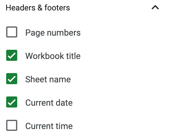
- From the menu, check the
Workbook Title, Sheet Name, and
Current Date boxes.
- Microsoft Excel
To improve the printing experience, order the sheet name tabs like this: Cover, Major Parties Pivot, Major Parties Chart, Representatives, Senators. then Shift-click the manipulated sheet name tabs to select them (all but the Voter_Registration_Data sheet). Then, from the menu choose .
Most computers and versions of Excel have drastically different print dialog boxes. Do your best to adhere to these Page Setup and Print requirements:- Print Active Worksheets.
 If you selected the five worksheets then you won't need to choose the page numbers.
Do not print the 1200+ rows of the Voter Registration worksheet.
Page numbers may vary depending on the order of your worksheets.
If you selected the five worksheets then you won't need to choose the page numbers.
Do not print the 1200+ rows of the Voter Registration worksheet.
Page numbers may vary depending on the order of your worksheets.
- Portrait Orientation.
- Letter 8.5x11 paper size.
- Narrow Margins.
- Fit all Columns on One Page (adjust this for each page as needed).
You might need to access the menu to adjust the Scaling settings:


- Customize the Header and Footer with the
file name, worksheet names, and date.

- Print Active Worksheets.
- Google Sheets
- Save/print the file as PDF.
- Double-check that you've added your first and last name to the filename, like this: Oregon-Counties-Parties-Reps-Senators-first-lastname.pdf.
- Look at the resulting file to ensure all the correct sheets printed. Do not to include the main Voter_Registration_Data sheet.
8.6 Ask for help.
Stuck on a specific step? Share your file with the instructor.
In order for the instructor and TAs to see your progress without having to download or ask for account permission, provide a correctly-set sharing URL so they can look at it live. Follow the most appropriate instructions below.
Paste the sharing URL into the Canvas Inbox message or Assignment Comment box, along with your questions. Note which step number you're stuck on.
Share Microsoft Office files from the OSU OneDrive cloud drive and share Google Suite files from the OSU Google cloud drive:
- Windows or Microsoft Account
- Login to your OSU OneDrive account from the browser.
- Drag the file from your hard drive to the OSU OneDrive file list in the browser to transfer it there.
- Beside the file name in the list, click the
 Share icon:
- Choose the settings provided in the screenshot below:

- Copy the link so you can provide it to the instructor or in the Assignment Comment box.


- Google Account
- With your file open, click the Sharing button at the top right of the screen. Or, if the file is not open but listed in the Drive, right-click it to choose the Share menu.
- Click the Get Link box to update the OSU Settings and copy the link:

- Ignore the Share with People and Groups box for this course.

Paste the URL into the Canvas Inbox message or Assignment Comment box, along with your questions. Note which step number you're stuck on.
8.7 Verify your work.
Doesn't your new document look great!
Examples of the four required sheets were provided above...take another look at step 8.5.
From the Canvas Home tab, click the Ch 8 ~ Data Manipulation assignment. Scroll to the bottom to see the Rubric. Compare your work to the Rubric to ensure you've included all paragraphs and design elements as well as reviewed/edited your work. The rubric is based on the following scoring criteria, which are based on the instructions above: Check off each criterion to confirm you've completed them before submitting the file.
- Sheet's cover paragraph is free of plagiarism.
- Sheets were submitted as a single PDF file with dates and sheetnames.
- Sheet cover page describes how spreadsheets become relational databases.
- Sheet Pivot table displays grand totals by Oregon county.
- Sheet Pivot table displays Democrats, Independents, Nonaffiliated, and Republican percentages in columns. All other parties are hidden.
- Sheet Chart displays Oregon county party affiliations in a horizontally stacked bar chart.
- Sheet Chart displays percentages for each party by color (values at the end of the row are optional).
- Sheet Chart title and labels are bright Blue.
- Sheet Chart legend displays in the top right corner or the middle right edge.
- Sheet VLOOKUP displays unique and correlating counties at the end of each Representative and Senate rows.
- Sheet VLOOKUP displays all the Representatives and Senate address cells with text wrapping.
- Sheet VLOOKUP displays all the Representatives and Senate web addresses with column resizing.
- Extra Credit: Located, imported, formatted, and printed a PDF list of representatives from your own state, province, reservation, or country.
8.8 Submit the file.
Each assignment must be submitted before the Due date and time as specified on the Canvas Home tab. The Available Until date and time constitutes a grace period, which can be used in an emergency, or if you are ill (it cannot be used for every assignment). Students who submit using the Available Until date may incur score reduction. Students on a DAS Flexibility Contract: there is no need to notify the instructor. All of your Available Until dates will be set to 72 hours past the Due Date, which can be used up to 3 times. Abuse of the Flexibility Contract will be reported to DAS.
- Click on the Canvas Home button and scroll down to the Ch 8 ~ State Representatives & Senators assignment. Click the assignment link.
- Upload the PDF file. Confirm that it uploaded.
 Check the TurnItIn Report for plagiarized phrases and sentences in the Cover sheet
(ignore highlighting in the sheets of data).
Review how to use TurnItIn.
Edit or add quote marks in your paragraph(s) to ensure the second draft of the file will pass the TurnItIn inspection.
Resave the PDF file.
Upload the newer version in the assignment's Submission Details screen.
Check the TurnItIn Report for plagiarized phrases and sentences in the Cover sheet
(ignore highlighting in the sheets of data).
Review how to use TurnItIn.
Edit or add quote marks in your paragraph(s) to ensure the second draft of the file will pass the TurnItIn inspection.
Resave the PDF file.
Upload the newer version in the assignment's Submission Details screen.
- Within 3 days of submission, be on the lookout for Rubric feedback and Comments from the TA and Instructor.
- Ask questions about the score and feedback in the assignment's Commenting box.
